


Smart Watch - Clock Wallpaper
4.6466.00 Reviews
App Specs
- Version
- 2.1.0
- Updated On
- License
- Free
- Downloads
- 5,000,000+
- Developer
- One Music Player
- Categories
- Personalization
- Platform
- Android, iOS
Screenshots
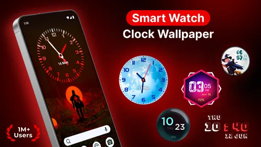
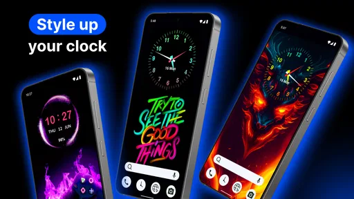
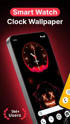
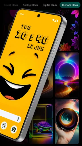
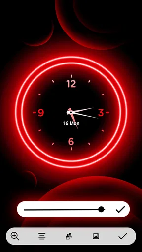
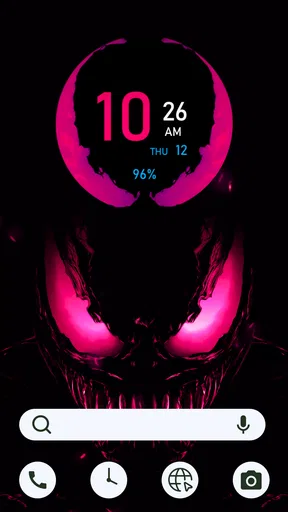
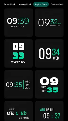
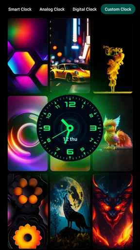
 Analysis by AppCompare
I judge a watch wallpaper by one practical question: does it make checking the time feel better without making the display harder to use? Smart Watch - Clock Wallpaper is a personalization app built around giving a clock display a more deliberate look, with a dark background as part of its visual focus. That sounds like a small change, but a watch is something I glance at repeatedly, so its appearance can shape the feel of an everyday routine. I see the appeal most clearly for someone who wants their screen to look less like a default setting and more like a personal choice.
A clock display with a stronger visual identity
The central idea is straightforward: use a designed clock wallpaper to change the look of the screen rather than treating it as a purely utilitarian display. A dark backdrop can make the clock feel calmer and more prominent, and it may suit someone who prefers a restrained look over a busy screen. The key benefit is visual, not a promise of new watch functions. I would choose this kind of app for the atmosphere it adds, then decide whether the finished screen is still easy to read at a glance.
That distinction matters when comparing it with the usual alternatives. A built-in watch face is often the simplest option because it is already part of the device experience. A broad wallpaper or personalization app may offer a different style, but it can also bring more choices than someone needs. This app’s clock-and-dark-wallpaper focus gives it a clearer purpose: it is for changing the visual character of a clock screen, not for replacing a watch’s underlying tools. If you are happy with your current face and mainly want new complications or deeper device controls, a built-in option may be a better fit.
What the darker look changes in daily use
A dark design can feel less distracting during quiet moments: checking the time before bed, glancing at the watch in a dim room, or keeping a desk setup visually simple. The trade-off is that contrast and legibility depend on the particular design and the screen you use. I would spend a moment checking the clock from the distance and angle where I normally look at my watch, rather than judging it only in the app preview. A beautiful layout is not much use if the time takes longer to pick out.
There is also a useful way to think about this app before installing it: it changes presentation, not the reason you bought a smartwatch. I would keep relying on the watch’s normal functions for everyday tasks and treat the wallpaper as a visual layer. That expectation helps avoid disappointment if what you really want is a new set of activity tools, notifications, or watch-face controls. The app makes the most sense when the default appearance is the thing you want to improve.
A realistic routine for deciding whether it suits you
Imagine checking the time while making coffee, then glancing at your wrist again on the way out. In those quick moments, a clean clock design can be pleasant because it gives the display a consistent look without asking you to stop and explore. At home, the same dark style might feel less visually loud beside other screens. I would try it during an ordinary day, not just while browsing designs, and pay attention to whether I can read the time immediately in both bright and dim surroundings.
One practical tip is to compare the chosen look against your actual routine before settling on it. If you often check your watch outdoors, legibility in strong light matters more than how polished the wallpaper appears indoors. If you mostly use it at a desk or at home, a subdued design may be a better match. A second tip is to consider the rest of your screen: a wallpaper that looks refined on its own can feel crowded if the watch face already places information over it. Keeping the visual goal simple makes it easier to tell whether the change is genuinely useful.
Worth Reading Before You Choose

EA SPORTS FC Mobile 26 Is a Bigger Football Game, but It Takes Time
Flipboard Shows What News Apps Must Do Beyond the Feed
Switching to Android Auto Means Rethinking Your Driving Routine
Google Calendar Makes a Crowded Week Easier to Manage
Ludo King Makes the Most of the Minutes Between Plans

Baby Panda World Brings Quick Play to Modern Phones, but Its Game Library Feels Busy
Where I would be cautious
The app’s appeal is tied to its narrow purpose, which is also its main limitation. A wallpaper can refresh the look of a clock, but it cannot make a watch more comfortable to wear or solve a need for richer information. I would skip it if you rarely notice your watch’s appearance, prefer the clearest possible built-in face, or expect extensive control over how the device behaves. I would also be careful about assuming that every design will suit every screen; the best choice is the one that remains readable, not necessarily the most decorative one.
It is worth checking the practical details before making it part of your setup. The app is free to install, while in-app purchases range from $0.99 to $99.99 per item, so I would look closely at any purchase screen and decide whether a paid option is worth it to me. It is rated for Everyone, and the current version is 2.1.0. It was released on Jan 24, 2023, and requires Android 7.0 or later. Those details make it easier to judge compatibility and cost expectations without treating the visual change as a necessary upgrade.
Who gets the most from this approach
I think the strongest fit is someone who likes a coordinated, personal look and is satisfied with the watch’s existing everyday functions. It can also suit a person who finds default screens bland and wants a dark clock presentation that feels more intentional. If you are choosing between this and a standard built-in face, ask yourself whether a new visual style is enough to make you enjoy checking the screen more often. If your priority is extra data or device-specific face controls, search for an option designed around those needs instead.
One more useful check is how the wallpaper fits the rest of your devices and habits. If you prefer simple, low-clutter screens elsewhere, a restrained clock look is likely to feel coherent. If you like bright colors, dense layouts, and lots of visible information, the app’s dark visual direction may not be your taste. I would make the decision based on the screen I want to see dozens of times a day, not on the novelty of trying another personalization app.
Made by One Music Player, Smart Watch - Clock Wallpaper has a 4.7 average from around 108,000 ratings and over 5 million installs. I take that as a sign that many people are interested in this kind of visual customization, not as proof that every design will work for every watch or preference. For a free personalization app, it is an easy idea to consider if your goal is simply to give a clock display a different mood. I would try it when appearance is the problem I want to solve, and stick with the built-in face when clarity or extra watch functions matter more.
First Impressions
From the moment I downloaded Smart Watch - Clock Wallpaper, I was impressed by its sleek design and intuitive interface. Setting it up was a breeze, and even if you're not tech-savvy, the app guides you through the process with ease. The app doesn't just slap a wallpaper on your watch; it offers a whole new aesthetic experience.
Customization Galore
What really sets this app apart is the sheer amount of customization options. You can choose from a variety of themes and colors, making it super easy to match your watch face with your mood or outfit. The app also lets you add widgets, which is a handy feature. I found myself spending quite some time just exploring all the different looks I could give my watch.
Function Meets Fashion
Now, I know what you might be thinking – "Isn't this just about looks?" Not at all! The app ensures that while you’re getting a visually appealing watch face, you're not compromising on functionality. It provides options to include essential information like weather updates, battery life, and step count right on the display.
Performance and Battery Life
Another thing I was concerned about was how the app would affect my smartwatch’s performance and battery life. Thankfully, the developers seem to have thought this through. I noticed that even with an animated wallpaper, the impact on battery was minimal. My watch ran smoothly without any noticeable lag.
Easy Integration
The integration with different smartwatch brands is seamless. Whether you're using an Apple Watch or an Android-based smartwatch, Smart Watch - Clock Wallpaper has got you covered. It supports a wide range of devices, making it versatile for almost any user.
Community and Updates
One of the cool things about this app is its active community. There are regular updates and new designs released frequently. Plus, the developers are quite responsive, taking user feedback into consideration for improvements. This means you can look forward to fresh content and enhancements regularly.
Is It Worth It?
If you're someone who loves to personalize your gadgets or just wants to add a touch of style to your smartwatch, then this app is definitely worth checking out. The blend of aesthetics and functionality makes it a standout choice for smartwatch users.
So, if you're ready to give your smartwatch a fresh new look, why not give Smart Watch - Clock Wallpaper a try? It's more than just a pretty face; it's a practical, customizable, and fun way to keep your watch looking sharp.
Pros
- Customizable watch faces for personalization.
- Live wallpapers enhance visual appeal.
- Low battery consumption for extended use.
- User-friendly interface and easy navigation.
- Regular updates with new features.
Cons
- Limited free watch face options.
- Some features require premium purchase.
- Occasional lag on older devices.
- Ads can be intrusive at times.
- Compatibility issues with some devices.
FAQs for Smart Watch - Clock Wallpaper
What features does the Smart Watch - Clock Wallpaper app offer?
The Smart Watch - Clock Wallpaper app provides a variety of customizable clock faces and wallpapers designed to enhance your smartwatch experience. Users can choose from digital and analog styles, adjust colors, and add widgets for weather, calendar, and fitness tracking. It also offers battery optimization features to ensure minimal power consumption.
Is the Smart Watch - Clock Wallpaper app compatible with all smartwatches?
The app is compatible with most Android and iOS smartwatches, including popular brands like Samsung, Apple, and Fitbit. However, it's always best to check the specific compatibility requirements listed in the app store to ensure seamless integration with your particular device model.
Does the Smart Watch - Clock Wallpaper app consume a lot of battery?
The app is designed with battery efficiency in mind, offering settings to minimize power consumption. Users can customize the refresh rate of the display and choose low-power modes to help extend battery life. Regular updates ensure that the app remains optimized for the latest smartwatch models.
Are there any in-app purchases or subscriptions required?
While the Smart Watch - Clock Wallpaper app is free to download, it offers in-app purchases for premium features, such as exclusive clock faces and additional customization options. Users can choose to subscribe for a monthly or annual fee to access the full range of features and enjoy an ad-free experience.
How easy is it to customize my smartwatch using this app?
The app is user-friendly, featuring an intuitive interface that makes customization straightforward. Users can easily browse through a wide selection of clock faces and wallpapers, drag and drop widgets, and preview changes in real-time. Detailed guides and customer support are available to assist with any customization queries.


